
 I don’t know how it was decided… maybe someone important got lost on his or her way through Ypsilanti… but word has apparently come down that we need to institute a comprehensive wayfinding system across the city, so that people, from here on out, will know which way they need to point their cars if they need to head for a hospital, the safety of Ann Arbor, etc.
If done well, wayfinding systems can be incredibly useful. And, to the credit of the folks behind this new initiative in Ypsi, we seem to be going about it the right way, opening the process up to the people who live here, asking them for their ideas, etc. Given Michigan Department of Transportation (MDOT) rules regarding signage on public roads, there’s not a lot of leeway, as I understand it… as they dictate quite a few of the elements… but there are some things that are open to local interpretation, and I’m curious to see what comes out of the process, as local designers and artists weigh in.
Speaking of the process, I’m told that the deadline for submitting your ideas is December 4, which is just a few days away, but I suspect there’s a good chance that an extension could be announced. [Stay tuned for updates on that front.]
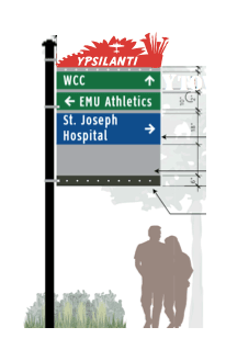
I’ve yet to read through all of the materials, but it seems as though the primary element that’s up for debate is the ornamental piece at the top of the the sign, which could be different depending on the site of the installation. For instance, the sign in Depot Town could have the silhouette of the old Freighthouse, whereas a sign on Michigan Avenue could have an illustration of HP Jacobos shaking hands with Iggy Pop. Or, of course, we could choose to go less specific, employing more broad design elements, like those currently used in our downtown bike racks. [I’m sure better ideas exist. These are just a few examples off the top of my head.]
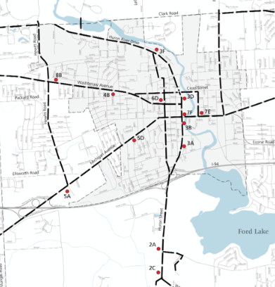
As it’s currently planned, there will be 13 of these spread throughout the City and Township. I’m not sure how the sites were determined, but here’s a map showing their tentative locations.
If you want to submit your ideas, all of the details can be found on the Ypsi Convention and Visitors Bureau site. [There’s also a Facebook thread about it.] Here’s a sample of what you’ll find when dig into the details.

Oh, and I should also mention that there’s a $1,000 honorarium for the individual or team that submits the winning design(s).
I’m hopeful that it’ll be cool, but things like this are tricky business. I can still remember the cringeworthy “Hipsilanti” banners, and I’d hate to see us go down the same path again, choosing a design that doesn’t really reflect the complexity, beauty and diversity of the community. But, as the process seems to be open and transparent, I suspect we’ll see something good come of it.
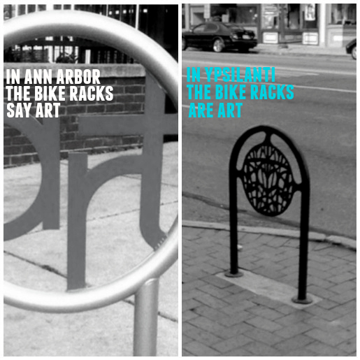
Speaking of bad public design, I’m reminded of the Ann Arbor bike racks, and this image that I made a while back, which was inspired by something my friend James Marks said to me.
This is an opportunity to do something good. If you’ve got an idea, take a crack at it. We keep hearing about how Ypsi is a community full of creative types. Let’s create something that demonstrates that… a daily reminder of who and what we are… something beautiful, something inspiring, something that speaks to our history and our entrepreneurial, visionary spirit.
update: The deadline has been extended until Monday, December 7.


21 Comments
There’s an app for that.
Just skip the ornamental hoo-ha at the top. Way finding signage is not a time to be clever or even try to sum up the identity of a community. It should just tell people accurately how to get places. Some color-coding might work. Please no historical styles. that never works. They are signs. They should be plain and legible not clever. https://www.vitsoe.com/us/about/good-design
People in the streets and parks, at church, shopping, and eating create the identity of a community, not signage. Please don’t make Ypsi a brand. SI understand the impulse, but inevitably someone will feel excluded.
I certainly understand your concern, Jean, and I agree that, if we can’t come to consensus around something good, we should opt for something more utilitarian and straightforward. That doesn’t mean, however, we shouldn’t go through this process and see what people come up with. And I do think it’s possible that we could come up with something both distinctive and inspiring. I think the bike racks downtown are a good example of something well-designed that people genuinely like. And I don’t think it’s unreasonable to assume that we could do it again.
I hope you are right. My point is that street signage has become increasingly ugly over time. The harder we try, the uglier it gets. It’s unfortunate that all signage is now advertising in some form. Sometimes you just want information. The bike racks are cool. So are the protective grates around trees that look like manhole covers. Maybe something good will come of it all. I would veer towards emphasizing Ypsi’s industrial heritage, like the bike racks, as that is commonly held.
i think the ornamental piece sucks too. someone submit a design that doesn’t include it.
oh never mind:
“Only those entries that conform to the design parameters will be considered.”
This all sounds fine, though a quick glance at the map of proposed sign locations tells me this is all about cars and auto traffic. If we are going to go through this exercise, it would be helpful to include signage that would be useful within and around Depot Town and Downtown for pedestrians.
Other than finding one’s way to the hospital it is better, in my opinion, if visitors to Ypsilanti stumble around and discover stuff on their own, somewhat randomly, or by engaging in conversation with a local *person*. Even worse, is the idea of having more government approved chotskies around Ypsi. On my next visit to Ypsi, I would rather see illegal graffiti over, what amounts to, publicly funded knick-knacks.
Is it really so bad if someone trying to find the football stadium accidentally drives down Michigan Avenue?
These designs have been traditionally created by way finding firms like Corbin Design from Traverse City, and result in safe, generic, designs… so it ends up that Chelsea = Northville = Plymouth = Keego Harbor. While I agree that the lower part of the sign needs to be efficient and functional, the upper part of the sign is an opportunity to reflect Ypsi’s unique qualities.
The solutions don’t need to be seen as permanent, they can be swapped and upgraded as time goes on…Let’s see what YVCB comes up with…there’s nothing wrong with visitors coming into town with a little smile on their face…
Since these signs are designed for people driving through town who are not familiar with it. how about some indication as to where to park, free or otherwise?
I help people with directions all the time! Signs would be majorly helpful. Usually they need to know how to get to the expressway or the EMU Convocation Center. I would totally enter the design contest if I weren’t in the middle of final exams right now.
Here is an example of what happens when people try to make signage public art–
http://www.arborupdate.com/files/entry_page_1.pdf
I don’t like current A2 signage, which looks like your prototype above, but it’s better than what they started with when they tried to be clever.
“the lowercase a shape, rendered as if from a typewriter, reflects Ann Arbor’s legacy and ongoing commitments to literate citizenry.”
lol. as if.
Is the idea to color-code things? Will all EMU things be green? Will all health and safety things be blue? Will all retail areas by red? Will all historic things be brown? Are there standards across Michigan communities?
“TACOS” with arrows pointing in every direction.
I’m sure Ypsi’s favorite artists will come up with something absolutely adorable.
Agreed that we need integrated and functional design choices for this signage — including for parking and directional signs. Faux historic is hideous.
As for other street furniture, Ypsi’s bike racks are indeed more artful than those in A2. Ann Arbor bike racks’ best adaptation by far took place back in ’09, when one of the “art” racks received the addition of the letter “f.” Leave out the art, someone will add it in.
http://www.annarbor.com/entertainment/the-deuce/ann-arbor-fart/
I’m not convinced that citywide wayfinding projects are always the best way to go. GPS systems in cars and phones make a much more robust system. That is not to say that these sign programs are without functional value when done well, but they are typically also treated as a streetscape beautification & city branding project. It is not always clear if the primary need is functional or “placemaking” … or where the line between those two needs is drawn for that matter. A sense of place is a functional need too.
Most of the wayfinding decision points for visitors seeking the Ypsi destinations are along state highways or business routes. The signs at these locations need to follow strict state department of transportation limits for safety reasons, narrowing down the creative/branding possibilities ( in this instance ) to a size 1/5th the total sign face and located on top. Add to this the NCHRP 350 required spindly breakaway posts and they become not more than an adjunct to the state highway signs. It may be prudent to forgo the decorative element and put the effort into a streetscape plan that encourages the community interactions that make a place a “place”.
It is easy to be critical though. Identifying the dozen or so destinations and helping people find them will be a good thing for Ypsi. Trying to brand a city is a whole other beast though….
For those interested, there is a book called “The Image of a City” written by Kevin Lynch. He originated the term “wayfinding” and his methodology for analyzing cities is still used by urban planners. It is also a very, very helpful tool for creating a dialogue with stakeholders to not only talk about the different facets of “place”, but also about values and understandings ( through mental maps ). It helps a community understand the relationships that make a place unique.
Also of interest in terms of “place”, there was an article written for the New Yorker a few years back by Eric Klinenberg that was about his research on the death rates in different neighborhoods in Chicago during a heat wave back in the 90’s, and lessons from this applied to future crisis. He found that the highest death rate and the lowest death rate during the heatwave were in two poor neighborhoods right next to each other. It really gets to the substance of the matter of “place” – what its true ends and assets are. ( Quote with permission of Eric Klinenberg )
“The key difference between neighborhoods like Auburn Gresham and others that are demographically similar turned out to be the sidewalks, stores, restaurants, and community organizations that bring people into contact with friends and neighbors. The people of Englewood were vulnerable not just because they are black and poor but also because their community had been abandoned. Between 1960 and 1990, Englewood lost fifty per cent of its residents and most of its commercial outlets, as well as its social cohesion. ” We used to be much closer, more tight-knit,” says Hal Baskin, who has lived in Englewood for fifty-two years and currently leads a campaign against neighborhood violence. “Now we don’t know who lives across the street or around the corner. And old folks are apprehensive about leaving their homes.” Auburn Gresham, by contrast, experienced no population loss during that period. In 1995, residents walked to diners and grocery stores. They knew their neighbors. They participated in block clubs and church groups. ‘During the heat wave, we were doing wellness checks, asking neighbors to knock on each other’s doors,’ Betty Swanson, who has lived in Gresham for nearly fifty years, says. ‘The presidents of our block clubs usually know who’s alone, who’s aging, who’s sick. It’s what we always do when it’s very hot or very cold.'”
http://www.newyorker.com/magazine/2013/01/07/adaptation-2
So if they have the signs on Michigan ave and they point the way to depot town how fast will they be torn down?
On the Facebook thread spawned by this post, Civ City’s Mary Morgan had the following to say about Ann Arbor’s experience.
“Aside from aesthetics, which are subjective, I think the signs don’t even meet the threshold of being useful. That’s $1M-plus of visual clutter for virtually no benefit – other than to say the city has wayfinding signs.”
I’ve just been told that the deadline have been moved to this next Monday, December 7.